
In the very wide world of designwhere images impact and excite much more than words, and visual experiences determine the emotions of users, the iconography and symbolism are fundamental tools with much more history and importance than we are aware of.
We tend to confuse these two disciplines as elements that are limited to embellishing or decorating a visual piece, without giving it a conceptual and significant value in the work.
In reality, throughout the history of design and the pictographic representationboth iconography and symbology have had and continue to have a profound impact on the communication, the perception and the effectiveness of messages.
For that reason, I would like to show how the iconography and symbolism they relate to each other, how they work in design and why they are key elements in the creation of digital products effective and able to stand out from the huge variety of products available today.
What is iconography and how is it connected to symbolism?
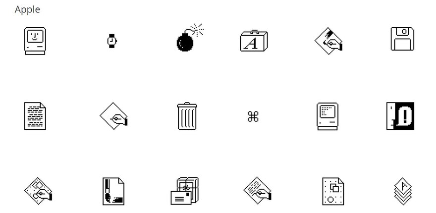
The iconography is defined as the the study and use of icons representing ideas, concepts or actions in a graphic and universal wayl. At designa icon has the ability to communicate complex messages in a very limited space, be it a "save" button in the form of a floppy disk (although the physical object is no longer relevant) or a magnifying glass suggesting "search".
The strength of a good icon lies in its ability to be recognised instantly, which makes it a communication tool very powerful, and sometimes, unfortunately, largely wasted and used merely as a decorative element with no real purpose.
The symbolismon the other hand, refers to the uThe use of visual elements which evoke deeper meanings, conceptual and even spiritual. While a icon is usually more literal and functional, a symbol can be more abstract, appealing to emotions, values, cultures or religions.
For example, a heart represents love, but its meaning can vary depending on the context: in a dating app it can indicate romance, in a social network it can mean "like" and in another app it can refer to "health".
These two The two ancient and undervalued concepts are intimately related. icons are usually symbolic, and the symbols can assume iconographic forms to fulfil specific functions within a design. Even so, it is important not to confuse them as the purposes of each are very different, although the importance of both is equally great both together and separately.
What is interesting about this relationship is how the two disciplines work together to build a visual communication that is functional, aesthetically and culturally resonant, obliging the designer to study and know what meanings can be associated with each one depending on the geographical and cultural context.
On a side note, this kind of subjectivity in the perception of elements The design of a design that shares many of the basic essential aspects of design, such as colour, form or, in this case, the iconography and symbolism.
Iconography in digital design: clarity in the user experience
Within the marvellous and studied world of digital designthe iconography is like the cornerstone in the user navigationis what allows it to be as intuitive as possible.
The digital interfaces we use today, from mobile applications to websites, depend on icons to guide the user in an efficient way.
This is where the user experience design (UX) plays a crucial role: a poorly designed icon or one that is not sufficiently understandable can lead to confusion and frustration, generating a bad experience to the user and, of course, impacting on the user's perception of the brand.
Principles of good iconography
- Universality: A icon must be understandable to all audiences, however diverse they may be, regardless of language, culture or customs. While this may seem challenging, using global standards helps ensure that users instantly understand your function and complete a successful navigation.
- Simplicity: How many less detail has an icon, the faster it will be processed by the human brain. This is where design comes into play minimalist, which seeks to reduce unnecessary elements that allow the user to understand the icon as clearly and quickly as possible.
- Consistency: Maintaining a consistent style throughout an interface enhances the user experience. If a design system combines icons with widely varying styles, it can break visual harmony and affect the perception of the product.
- Scalability: Icons must adapt to different sizes without losing legibility. This is especially important in the era of high-resolution displays, where fine details can be distorted.
It must also be taken into account due to the large number of people who browse via a mobile device, where the screen is much larger. reduced in size, therefore, the information and the elements as well.
The success of a interface is for users to feel comfortable navigating the site, and for the icons are essential to this.
For example, the action button design o Call to Actions, such as "add to cart" or "share" on social media needs to convey its purpose without requiring additional text, which is why they are always so similar and placed in the same places on a website. interfaceThe user already knows, more or less, where it is going to be and what shape it is going to have.
Symbolism: culture, emotions and storytelling in design
Unlike the iconographywhich focuses on functional clarity, the symbolism seeks to connect with the user on an emotional or cultural level.
The symbolism at design not only provides aestheticsbut gives depth to a message, the conceptualises and expandinviting users to interpret and relate to it.
Symbols in graphic and digital design
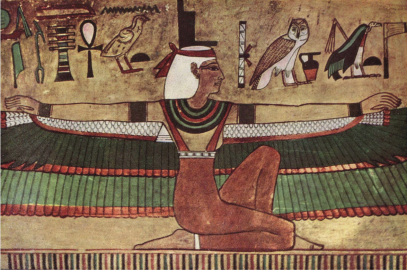
The symbols have roots deep in human history, and many of them have evolved along with cultures. In the context digitalMany of these meanings still persist, but are adapted to new uses.
Designers should be aware that symbols do not mean the same thing in all cultures and/or contexts.
A circle with a cross inside may represent "cancel" in some interfaces, but in other cultures it may be interpreted as a religious symbol. The context defines the meaning of a symbol and how it should be applied in design.
The symbols are not only forms, but also colours and patterns. A red triangle may evoke danger or warning, while a green circle represents approval or safety. This symbolism psychological is key in the user interface designwhere quick decisions are essential.
The symbolism also plays a prominent role in the creating visual narrativesHence, any process needs a narrated history o storytelling to help us create and understand.
The logos are a perfect example: a bitten apple represents not only a technology brand, but also ideas such as simplicity, innovation and design.
When iconography and symbolism merge
The real magic happens when the iconography and symbolism work together in a design. This balance is fundamental to creating interfaces that also resonate emotionally with users.
A notable example is the use of animated icons in modern applications. When a user completes an action, such as sending a message or making a purchase, a small animation symbolic can strengthen the experience. The animation not only confirms the action (iconography), but also brings emotional satisfaction (symbolism).
This is a tool that is increasingly used because it does not mean a significant effort for the designers and developersbut it does result in a understanding much clearer and quicker for the user.
Another case is the logo design that combine both disciplines. For example, the FedEx logo uses a hidden arrow between the letters "E" and "X". This iconographic element represents movement and direction, while the symbolism of the arrow reinforces the idea of efficiency and speed.
The importance of cultural context
One of the largest challenges in design today is the globalisation of digital products. While the technology connects people from different cultures, it also presents difficulties in the communication visual. Both the iconography as the symbolism must be carefully adapted to avoid misunderstandings between cultures.
For example, in the West, white is associated with purity and peace, while in many Asian cultures it represents mourning and death. Designers should investigate the interpretations cultural of icons and symbols to ensure that they are appropriate for the target audience.
Iconography and symbolism in branding

At brandingthe iconography and symbolism have a significant impact on a brand's visual identity. A logo is more than just an attractive design; it is an effective graphical representation of the values, objectives and promises of a companyis the first image and perception that a person receives and generates about the company.
The icons within a brand identity can be used in multiple formats, from mobile applications to printed materials, while the symbolic elements help to establish an emotional connection with the audience. For example, the use of animals in logos (such as a lion or an eagle) often symbolises values such as strength, leadership and/or vision.
Challenges in creating effective iconography and symbolism
Although the icon and symbol design may seem simple, it is a process that involves research, creativity and extensive testing. Some common challenges that can be highlighted are:
Visual saturation: In a world where users are constantly exposed to thousands of images, everything around them is aimed at capturing their attention, this makes it very difficult. Creating something that stands out and is memorable today is more valuable than in previous years.
Cultural barriers: The meanings of the symbols are not universal, which can result in misunderstandings if the right context is not considered.
Balance between aesthetics and functionality: While symbols can be aesthetically pleasing, icons must prioritise functionality. Finding this balance is a key skill for designers.
Undervalued but indispensable resources
When we understand what both the iconography and symbolismWe realise that these are not merely secondary aspects of the digital designbut essential components that impact the way users experience a product.
Understanding how the two concepts relate to each other and complement each other is very important from the point of view of a design professionalbecause in order to creating effective and culturally relevant designs these concepts need to be taken into account as an important part of the process.
As a designersOur job is not only to beautify, but to communicate clear ideas and connect with the emotions of the users, to transmit and awaken feelings that we ourselves feel and hide.
It's beautiful to show the world how you feel, to open yourself up through a creative performanceand that the people who see it have no idea that what you are expressing is yours, but that they themselves feel the same way.
When the iconography simplifies the functionality and the symbolism delves into the meaning, the design not only informs, but inspires and motivates, and in a world where every pixel counts, that can making the difference between a product that is forgotten and one that leaves its markThe same will be true of a message that is not intended to sell, but to resonate.


