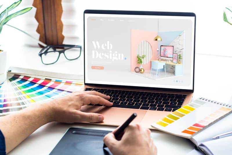
Make a SEO web design is crucial if we want our website to rank in Google. Communication between the design and SEO departments becomes essential to have a product that is beautiful, functional, and that the Google algorithms are able to read correctly.
In our Google SEO agencywhen we make a SEO web design there are three key points to be achieved:
1. An accessible and functional website
2. A page optimised for SEO
3. Aesthetically pleasing design
Although the SEO optimisation does not necessarily have to be carried out at the time of the conceptualisation of the websiteis very important and much more economical. Just think about it, what's the point of paying a designer to make changes after the fact when they could have done it "right" from the start?
It is not only a cost savingsIt also prevents the solutions applied from looking cheap or improvised. If we want a flawless design, our designer has to take into account the SEO and UX needs of our website.
This is the only way to achieve our goal, which is to have a website that is up to par, both for the user and for Google.
Key aspects of SEO web design

As you may not know what your SEO web designI will elaborate on some of the most important points. If your web designer (or yourself as a designer), take this into account when conceptualising the website, you will already have part of your SEO work done.
If not, before thinking about your SEO content strategyyou'll have to get in touch with optimise the website if you want the better results. Fortunately, it is never too late to modify the web, although it is always better sooner rather than later.
Responsive design

The first thing to consider is that the web site must be responsive. In other words, it has to be adaptable to mobile devices and tablets. Nowadays, most web traffic comes from our smartphones. Therefore, we should even prioritise mobile design over desktop design.
Let me explain myself better, the design must always be perfect on all devices.But if, for example, we are hesitating between something that favours or looks better on desktop and something that looks better on mobile (even if it looks good on both), we will always have to prioritise the phone.
Do all websites always have more mobile traffic than desktop traffic? No. For that it would be good to look at the Analytics of our current website. In my experience, B2C businesses tend to have up to 70% more mobile viewswhile the B2Bfor the time being, they are keeping a little more than desktop viewsas they are often consulted at work.
However, from what I have seen, even in the most specialised businesses in B2B there is usually at least 40% of mobile views and this percentage will continue to grow. So my recommendation is that even if there is more desktop traffic, if the difference is not very high, let's keep going mobile because more and more users will enter in this way.
Loading speed

Beyond the responsive designThe main thing that a web designer should take into account is the importance of the loading speed. The web must be light if we want it to be positioned and even more so nowadays with the importance of the Web Core Vitals.
Since last year, the loading speed has ceased to be an element that was taken into account indirectly in positioning and has become a direct and fundamental factor.
The website must be fast. This may mean doing without many elements that we might want to introduce. Here, the SEO and the UX shake hands, because there is nothing more annoying to a user than a website that takes a long time to load..
Aesthetics over functionality

Another potential problem to be solved by the SEO web design is that of the aesthetics over functionality. We all like a beautiful website, but the website cannot be beautiful and not very usable.
This type of problem is, in fact, common on artists' and graphic designers' websites. They try to "show off" themselves so much that they end up creating a website difficult to understand for both the user and the algorithm.
The key is not to complicate things. Aesthetics matterBut if the user is not able to find what he or she is looking for immediately, it will no longer matter. On the Internet, there is no such thing as patience, calm, trying to find things out. On the contrary, you have to "go for broke".
Headings and information structure

When I talked about SEO content I have already mentioned to you more than once the importance of structure the information correctly with HTML headers. In order to work properly, they must be predefined in the web design.
There must be only one H1the H2 correctly positioned, if there is a H3 and that they are adapted to the type of content that is going to be on the page. In this sense, it is important not to use a heading with a structure that is repeated on all pages.
For example, if we always have a contact formFor the designer, it will probably be easier to put your title as a heading, but you should make it the required size while keeping the paragraph format because it will not provide distinctive information about the specific page.
The key thing to follow with headings is that. They must be different between pages and refer to the content of the pages. If we are going to repeat an element on all pages, we can't program it as an HTML header but as paragraph.
This is usually the most common mistake (because it is quicker to do it as a header) when we talk about SEO web design.
UX, the great ally

This has been mentioned before. UX o web usability is a very important aspect to consider in everything we do on the web. That is to say, our website has to be accessible and user-friendly for any user.
The more satisfied the user is with his or her experience on the weband we'll have better indicators and all that. will be reflected in SEO in an indirect way..
UXis also very important for generate higher conversions. Thus, placing forms and buttons in the right places, ensuring that the user always knows where to find what they need and, in short, making life easier for them, will make the design and the SEO work together much better.
Readable texts, videos and images

Another crucial aspect in the SEO web design has to do with the texts e images that we introduce on the web. It is important that Google can read them, so, for example, if we put an image with text, we have to add the text as code and not that it is written in the image we upload.
Likewise, images and videos will have to be accompanied by their alternative text or ALT text written. If we do not explain to Google what the image is about, it will not understand it because, at the moment, Google can only process its meaning based on the title and the ALT.
The ALTIt also helps to make the image accessible to people with disabilities.
Regarding the texts, we must not forget that if we put it in a way that the user cannot read it, it is only to help us to position ourselves, Google will qualify it as a practice of Black Hat SEO and penalise us.
With regard to videos, it should be borne in mind that they tend to be very heavy. Therefore, it is much more advisable to insert embedded videos from external sources such as YouTube or Vimeo. In this way, the upload will not have to bear the weight of the video as well.
Scroll

Finally, we have to talk about the most complicated aspect for a designer: the scroll. The scroll refers to the number of times you have to scroll through a web page to find what you are looking for.
In order for the SEO web design It is important that these times are as few as possible. Everything essential should be on the first screen the user accesses, without having to scroll down to find what they are looking for.
This is relatively straightforward in the desktop versionbut not so much in mobile, and we've already said that's very important. So, can you get things in by doing scroll? Yes, but you always have to anchor what is important at the top.
By following these little keys, we will be able to make a SEO web design in which the user finds an attractive and usable website, while the algorithm has all the information it needs.


