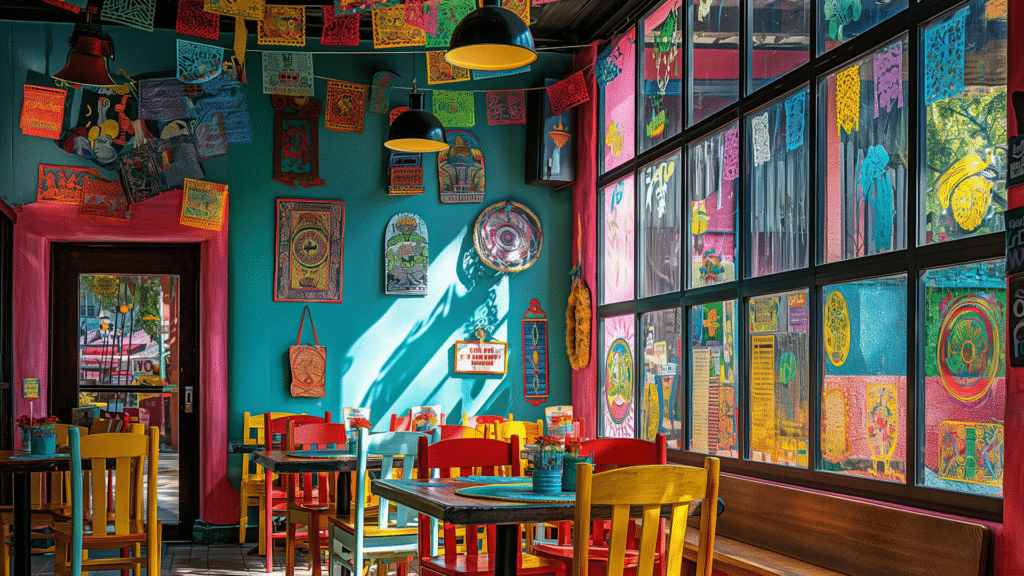
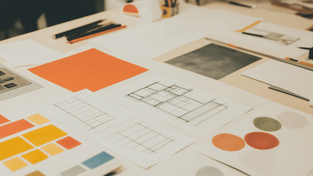
In the previous article on design, we talked about the 10 trends of 2024 and forecasts for 2025 where we showed what was the colour trend of that year and the impact it had. Colours have an impact on us, which is why it is important to understand the psychology of colour in graphic design and also to analyse what the colours are capable of generating in the people who visualise them.
In the graphic designthe colour is one of the most powerful elements, ranging from provoking emotions to influencing decisions. The strategic use of colour can be the difference between a design that captures the attention of the audience or one that goes unnoticed.
With this article we will explore the colour psychologyhow it affects the user decisions and how any designer can apply these principles to maximise the impact of their work.

1. What is colour psychology?
The colour psychology is the study of how colours affect our perception of emotions, perceptions and behaviours. It is based on the idea that colours have associations with each other. symbolic and physiological that influence how we interpret them.
While these associations may vary according to culture and context, there are general patterns that designers can use to communicate specific messages.
Factors influencing colour perception:
- CultureFor example, in the western culturethe white symbolises puritywhile in some Asian cultures is associated with the mourning. In countries such as Indiathe red is associated with the marriage and the fertilitywhile in West is often associated with passion o danger. The blacksymbol of elegance in Western fashion, it is considered negative or associated with evil in certain cultures. Even within the same country, different cultural groups may assign varying meanings to colours, such as the greenwhich can represent hope o prosperity in some cultures and jealousy in others.
- ContextAnother example is the red can transmit danger on a road sign, but passion in a marketing campaign. In the . culinarywarm colours such as orange or the red can stimulate appetitewhile the cold tones as the blue could narrow it down. In interior design, one and the same colour can convey different sensations: a dark grey can feel modern in a living room, but dreary in a small room. Also, colours in technological products tend to be associated with functionality and modernity, while in toys they seek to awaken more joyful or creative emotions.
- Personal experiences: The emotions and memories individual associated with a colour also influence their perception. A person who grew up surrounded by nature may associate green with tranquillity and vitality, whereas someone with negative experiences in similar environments may see it as oppressive or uncomfortable. The emotional impact The choice of colours may depend on significant events, such as the choice of a dress for a special occasion, which will leave a permanent memory linked to the colour. Even early childhood interactions with colours, such as toys or rooms, can shape how a person perceives those tones in adulthood.

2. Importance of colour psychology in graphic design
The colour is not just a decorative element; it is an essential tool for:
- Capturing attention: The strategic use of bright or contrasting colours allows us to highlight elements key to a design. For example, the warm colours as red and yellow are visually stimulating and immediately catch the eye of the viewer. This is especially useful in advertising and interface design, where catching the eye in seconds can make all the difference. Contrasts such as white on black or complementary colours can make sure that important elements do not go unnoticed.
- Conveying a messageEach colour has emotional and cultural associations that can influence how a design is perceived. For example: Choosing colours consistent with the identity and a brand's message is essential to generate the right emotional connection with the audience.
- Creating a brand identityThe consistency in the use of colour creates visual recognition and reinforces a brand's identity. Brands such as Coca-Cola (red), IKEA (yellow and blue) or Starbucks (green) are easily recognisable by their colour schemes. By maintaining a specific colour palette at all touch points, companies build familiarity, trust and loyalty among consumers.
- Improving usability: En digital interfacesthe colour acts as visual guide for users. It can direct attention to important actions, such as call to action buttons (CTAs) which often use contrasting colours, such as green or orange, to stand out against the background. In addition, the correct use of colours can improving accessibilityThe system is designed to ensure sufficient contrast for the visually impaired, and to signal specific statuses such as errors (red) or successes (green).
A classic example is the call to action button (CTA). Colours such as red, orange or green are often chosen so that users can quickly identify and press them.

3. Colour psychology: emotional associations of the main colours
Each colour has a characteristics and conveys a emotions o sensations.
Red
- FeaturesEnergy, urgency, passion, danger.
- Common usesSales advertising, food, sports.
- Effect on the userIncreases heart rate and generates a sense of urgency. Ideal for quick promotions, but excessive use can lead to anxiety.
Example: Brands such as Coca-Cola and YouTube use red to convey energy and attract attention.
Blue
- Features: Calm, confidence, security.
- Common usesBanking, technology, health.
- Effect on the userPromotes confidence and reassurance, ideal for brands that want to project professionalism and stability.
Example: Facebook, LinkedIn and PayPal use blue to communicate reliability.
Yellow
- FeaturesHappiness, energy, optimism.
- Common usesToys, fast food, entertainment.
- Effect on the userStimulates the brain and attracts attention, but can be overwhelming in large quantities.
Example: McDonald's combines yellow and red to stimulate appetite and project optimism.
Green
- FeaturesNature, health, wealth.
- Common uses: Agriculture, organic products, finance.
- Effect on the user: Represents balance and freshness, perfect for brands related to sustainability or wellness.
Example: Starbucks uses green to associate itself with calmness and closeness to the consumer.
Black
- FeaturesElegance, sophistication, mystery.
- Common usesFashion, luxury, technology.
- Effect on the user: Projects exclusivity and authority, but can appear aloof if not used with balance.
Example: Luxury brands such as Chanel and Apple opt for black to reflect elegance.
4. How colour affects user decisions
The colour always affects the decisions that users can make in different ways. We can see this reflected in:
4.1. Attention-grabbing
The colour is one of the first things that we perceive in a design. Colours bright and contrasting are particularly effective in attracting attention, as in advertisements.
4.2. Generating emotions
The colour triggers almost instantaneous emotional responsesThis makes it a key element in influencing purchasing decisions.
- Example: The warm tones such as red or orange in fast-food places drive quick decisions.
4.3. Visual guidance
In the UX/UI designthe colour helps to direct the user to the most important actions. The ACTION BUTTONSfor example, they are often highlighted with bright colours as green (to confirm) or red (to cancel).
4.4. Confidence building
Colours such as blueassociated with the security and professionalism, are common in banking and financial services applications for building credibility.

5. How to choose the right colours in graphic design
In order to make the right choice of colours it is necessary to respect 3 basic laws:
5.1. Defines the purpose of the design
- What is the message? If you want to convey joy, a colour like yellow can be ideal. If you are looking for professionalism, blue is the best choice.
5.2. Know your audience
The perception of the colour varies according to demographic and cultural factors. Researching your audience is crucial to selecting an effective colour palette.
5.3. Uses colour theory
Understand basic concepts such as:
- Complementary coloursThey offer contrast and visual balance.
- Analogue coloursThey create harmony and fluidity.
- Triadic coloursThey bring dynamism.
5.4. Do some testing
Performs tests of usability to make sure that the chosen colours have the desired effect on the audience.

6. Tools for working with colours
In the graphic designThe tools suitable for choosing, combining and applying colours is fundamental to achieve visually attractive and effective compositions and therefore to be able to play with the psychology of colour. In this article we present some of them that may be useful to you:
6.1. Adobe Colour
Adobe Colour is an Adobe tool for create, explore and share colour schemes. It allows you to generate palettes based on colour harmony rules, extract colours from images and explore community colour trends.
6.2. Coolors
Coolors is an online tool for generate, customise and share colour palettes quickly and easily. It offers features such as automatic adjustments, colour trend scanning and palette extraction from images.
Contrast Checker
Contrast Checker is a tool that evaluates the contrast between two colours to ensure the readability and accessibility of the text. according to the WCAG (Web Content Accessibility Guidelines).
6.4 Tailwind CSS Colour Generator | FIGMA
Tailwind CSS Colour Generator is a tool that allows create personalised colour palettes compatible with Tailwind CSS and apply them directly in Figma design projects.

7. Case studies: successful brands and their use of colour
Some brands know how to manage the psychology of colour and its impact on the viewer in a very positive way. In order to understand this more clearly, in this article, we develop some examples:
- Coca-Cola: Uses red to transmit energy and emotionwhich has helped position its brand as synonymous with happiness.
- IKEAYour combination of yellow and blue generates a feeling of optimism and confidence, ideal for attracting a diverse audience.
- Spotify: Usa bright green to partner with freshness and innovation, standing out among streaming platforms.

Conclusion
The colour is much more than a decorative element or a subjective conceptas we have seen throughout the article, and above all in the graphic design. Using colours correctly we manage to give use of a very powerful psychological tool that can directly influence users' decisions and behaviours.
Understanding the colour psychology and know how to correct application is essential for any designer which seeks to create impactful and effective messages. Al choosing colours strategically and adapting them to the context and audienceyou can transform a design into a memorable and functional experience and get away from the perception that designing is a subjective realm where you simply develop compositions with a subjective concept. The colour is one of the fundamental pillars of graphic design to start to understand that not everything depends on taste and subjectivity and that it has a research and very psychological background.


